AI design check · live results

does this layout
follow the brand?

Upload a poster, a social post or a PDF and the check compares it with your brand guide — colours, typography, logo, imagery, layout and tone. Below are four real checks against our demo brand VANTIC — none of them obvious at first glance. Nothing was edited afterwards.

4layouts checked
6criteria per layout
12findings
2measured, not judged

Step 1

Measure

Colour areas are clustered and compared with your palette using ΔE2000. PDFs additionally reveal their fonts, vector colours and page format. No AI involved, identical every run.

Step 2

Compare

Claude sees your labelled reference images — logos, clear space, Do/Don't pairs, official applications, imagery — plus the measurements, and rates six criteria. Every finding must cite a rule that exists in your guide.

Step 3

Verdict

Findings with invented rules or made-up colour values are dropped server-side. The verdict follows deterministically: a critical finding means non-compliant, a warning means largely compliant.


four layouts, one brand

what the check
actually said.

VANTIC is our fictional urban sports brand — you can browse its guide any time. Reports were generated in German and translated here; severities, sources and criteria are unchanged.

A brand-new social post

Social post

01 · new layout, on brand

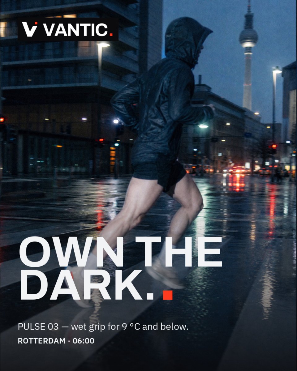
A brand-new social post

Compliant

What we uploadedA photo the guide has never seen (runner, blue hour, flash, motion blur), set as a 4:5 post in the brand typeface and colours with one Signal square and the negative lockup.

  • Colours
  • Typography
  • Logo
  • Imagery
  • Layout
  • Tone
  1. hint AI Tone

    Location does not match the photo

    The copy says ROTTERDAM, the photo clearly shows Berlin (TV tower). Conflicts with the brand principle Precision.

  • Exactly one Signal element; the red city lights in the photo count as natural light, not as a second accent.
  • Photo style hits the brand precisely: night city, rain, mixed light, motion blur.
  • Logo solved as a negative lockup on a solid dark area for legibility.

Why this mattersColour, type and logo are all correct, so the verdict is compliant. The AI still noticed a factual mismatch between copy and image and filed it as a hint, not an error.
Right type, right colours, wrong photo

Social post

02 · imagery

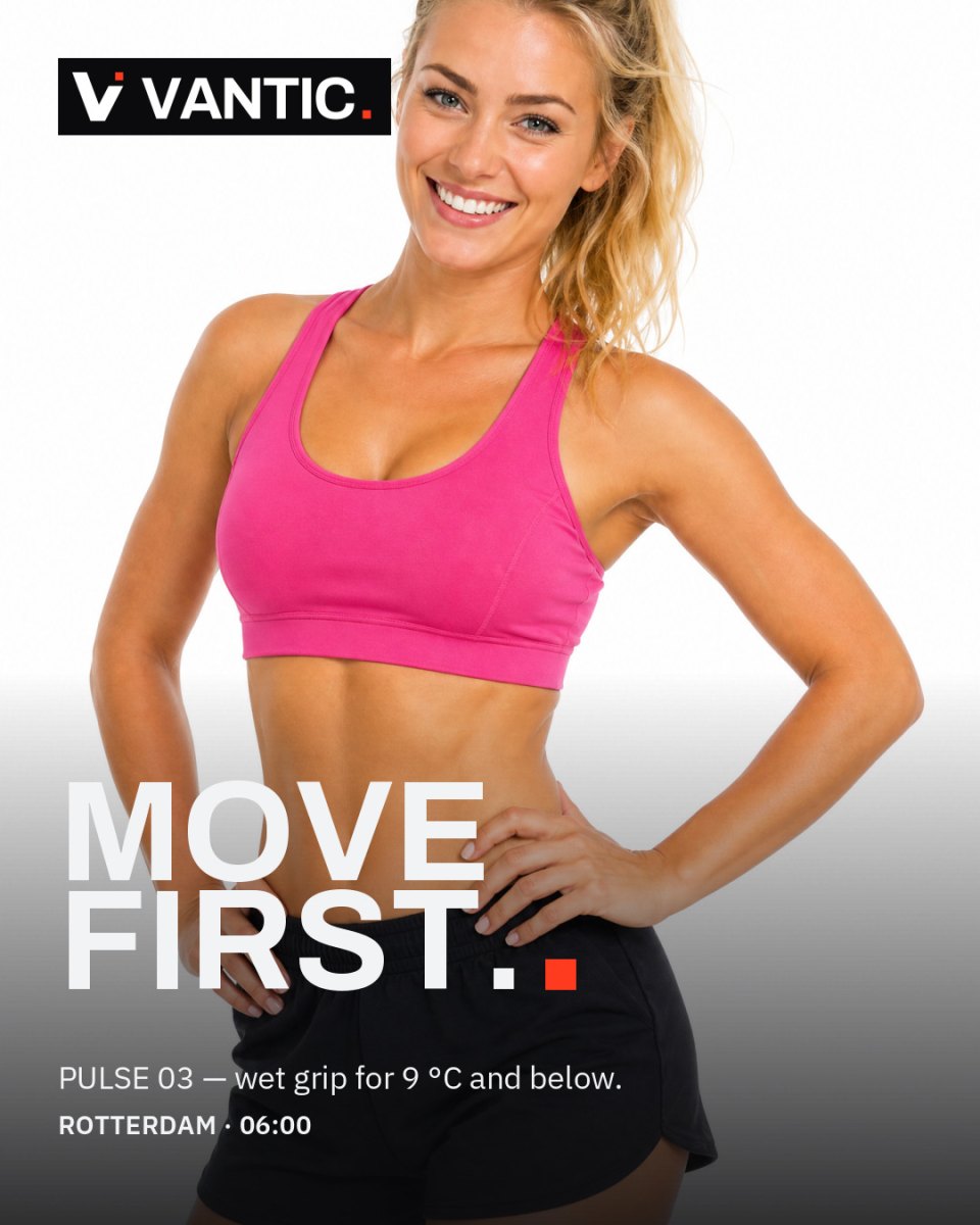
Right type, right colours, wrong photo

Non-compliant

What we uploadedTypography, colours and logo are correct. The photo is a high-key studio shot with a smiling model — precisely the Don't in the guide's photography rules.

  • Colours
  • Typography
  • Logo
  • Imagery
  • Layout
  • Tone
  1. critical AI Imagery

    Studio, hero pose, smile at the lens

    Posed person smiling into the camera in front of a studio seamless with glossy retouching — the pattern the guide explicitly rules out.

  2. warning AI Imagery

    Studio light instead of real light

    Soft, even studio lighting; no movement, no grain, no mixed colour temperature.

  3. warning AI Colours

    Second saturated colour in the frame

    The pink top (#f04082, off-palette) competes with the Signal square. The look wants exactly one red-orange accent per image.

  4. warning AI Layout

    Black logo box on the photo

    In the official examples the logo sits directly on the image.

  • Ground and accent are exact: Ice tone at ΔE 1.8, the Signal square as the only colour accent in the type.
  • Type hierarchy with the large display line bottom left and the logo in the corner follows the official examples.

Why this mattersImagery cannot be measured in numbers. Here the AI judges against the guide's photography principles and its Don't images — and quotes the rule it applied.

The photo the guide explicitly forbids

Social post

03 · imagery vs. the guide's don'ts

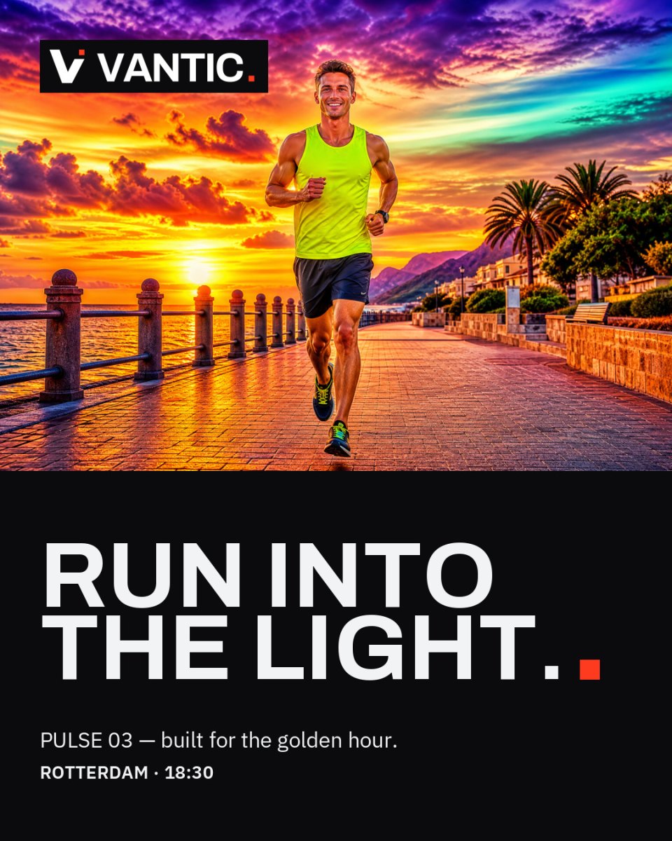
The photo the guide explicitly forbids

Non-compliant

What we uploadedThe guide's own Don't photo (HDR stock look: saturated sunset, smiling runner, neon shirt) set as a 4:5 post in the brand's tile layout: photo on top, Asphalt ground, display line in the brand typeface, one Signal square, negative lockup. Everything the designer controlled is correct.

  • Colours
  • Typography
  • Logo
  • Imagery
  • Layout
  • Tone
  1. critical AI Imagery

    Saturated HDR sunset

    Heavily saturated, HDR-style sunset with glossy reflections — exactly what the rule »no HDR, no saturated sunsets, no glossy grade« and the guide's Don't image rule out.

  2. critical AI Imagery

    Hero pose, smiling at the lens

    The centred runner poses frontally and smiles into the camera. The guide wants documentary images where the athlete does not notice the camera.

  3. critical AI Colours

    Rainbow and purple tones in the image

    Purple (#85519f), a rainbow gradient, teal (#68d1bb) and a neon yellow shirt — several strong foreign colours. The rule allows one red-orange Signal element in a dark frame.

  4. warning AI Imagery

    Several accents instead of one

    Next to the Signal square in the design, the neon shirt dominates as a second colour accent.

  • Clean Asphalt ground with the Ice display line — the colour roles of the design are hit exactly.
  • Only one Signal square as design accent, logo correctly top left.
  • Layout structure (photo strip on top, text ground below) follows the official application example.

Why this mattersThe check matched the photo against the guide's Don't images and named the exact rules. Layout, type, colours and logo pass; the stock photo alone sinks the post.

04 · PDF

An A4 flyer that looks like agency work

Non-compliant

What we uploadedA flyer in the brand's layout logic: photo, lockup, headline band, three info columns, button. Built in: body font DejaVu Sans instead of Archivo and IBM Plex, Signal as the ground behind headline and copy, a violet button. At a glance it passes.

  • Colours
  • Typography
  • Logo
  • Imagery
  • Layout
  • Tone
Measured #7a3fd1 · nearest Concrete · ΔE 27.7 DejaVu Sans · not defined DejaVu Sans Bold · not defined
  1. critical measured Typography

    Foreign fonts embedded in the PDF

    DejaVu Sans and DejaVu Sans Bold are not defined in the guide. Brand fonts: Archivo, IBM Plex Sans.

  2. critical AI Colours

    Signal as a large background

    The accent colour fills the whole middle band, roughly a fifth of the page, and sits behind headline and body copy. The rule: at most 10 %, marks the one action, never a ground behind text.

  3. hint measured Colours

    Off-palette vector colour

    #7a3fd1 found once in the vector data (the button), nearest brand colour Concrete, ΔE 27.7. All other vector colours sit exactly on the palette.

  • The night-city photo hits the imagery exactly: single runner, motion blur, mixed available light, wet street.
  • Logo use is clean: negative lockup top left on the dark photo, correct variant and position.
  • Tone is on brand — English, direct, honest.

Why this mattersIn PDFs, fonts and vector colours are read straight from the file. The font swap no eye would catch is a hard, reproducible finding — and the six palette colours in the file all measure at ΔE 0.


honest limits

what it
cannot do
(yet).

We test the check against a fixed set of layouts before every prompt change. These are the three limits we know about — and tell you up front.

Fonts in pixel images

In a JPG or PNG there is no font name to read. The AI judges typography by character only — a swap from Archivo to the similar-looking Manrope went unnoticed. In PDFs, fonts are read exactly.

Distorted logos

A lockup stretched by a factor of 1.7 is caught in roughly every second run. There is no measurement for proportion yet, so this remains a visual judgement.

Only as good as your guide

The check reads rules and reference images from your guide. Missing logo files, undefined colour roles or no Do/Don't examples mean fewer checkable criteria — the readiness score in the portal shows you exactly what to add.


the guide behind it

meet VANTIC.

Every rule the check applied above lives in this guide: colour roles, logo variants, clear space, Do/Don't pairs, photography principles. Built entirely with Branddoq modules.

your brand

check your own layouts.

Design checks are included in the Standard, Premium and Enterprise plans — five, one hundred or unlimited per month. Your guide is the rulebook; the readiness score tells you what to add.


your brand guide.

alive.

for everyone.